Convention Setup 5.0, Simplified!
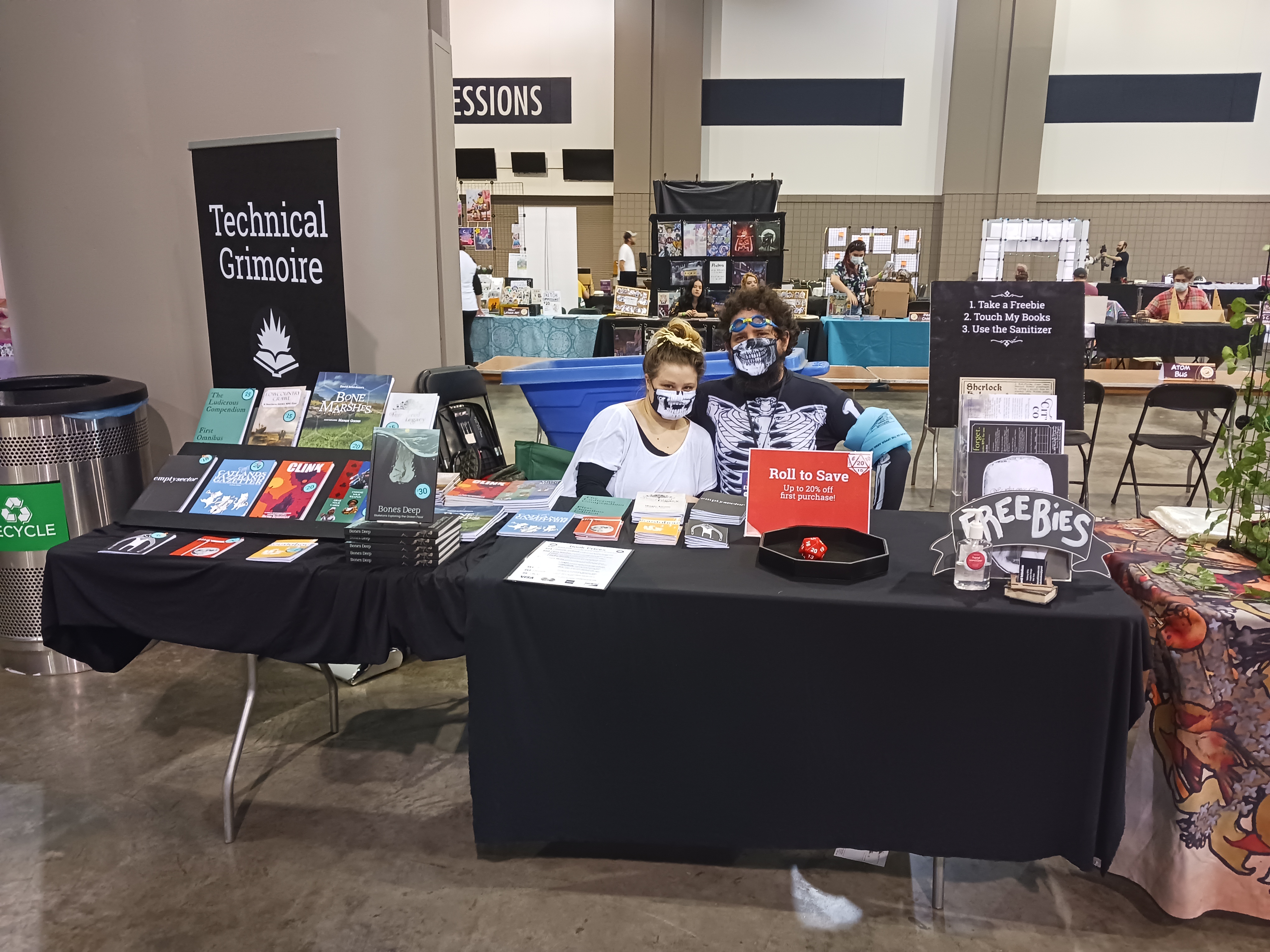
Today’s hot take: It is possible to be TOO polished and professional at a convention.
Let’s explore that a bit, shall we?
Today I’m actually taking a step “backwards” with my convention display. I’m going to try and simplify it considerably, sell even fewer items, and cut down on my signage. Why? How?
I Want Weirdos Permalink
Maybe this is just me, but when I go to a convention I’m there to see new, weird stuff and interact with passionate creators. I don’t want buy a copy of Munchkin or Magic the Gathering.
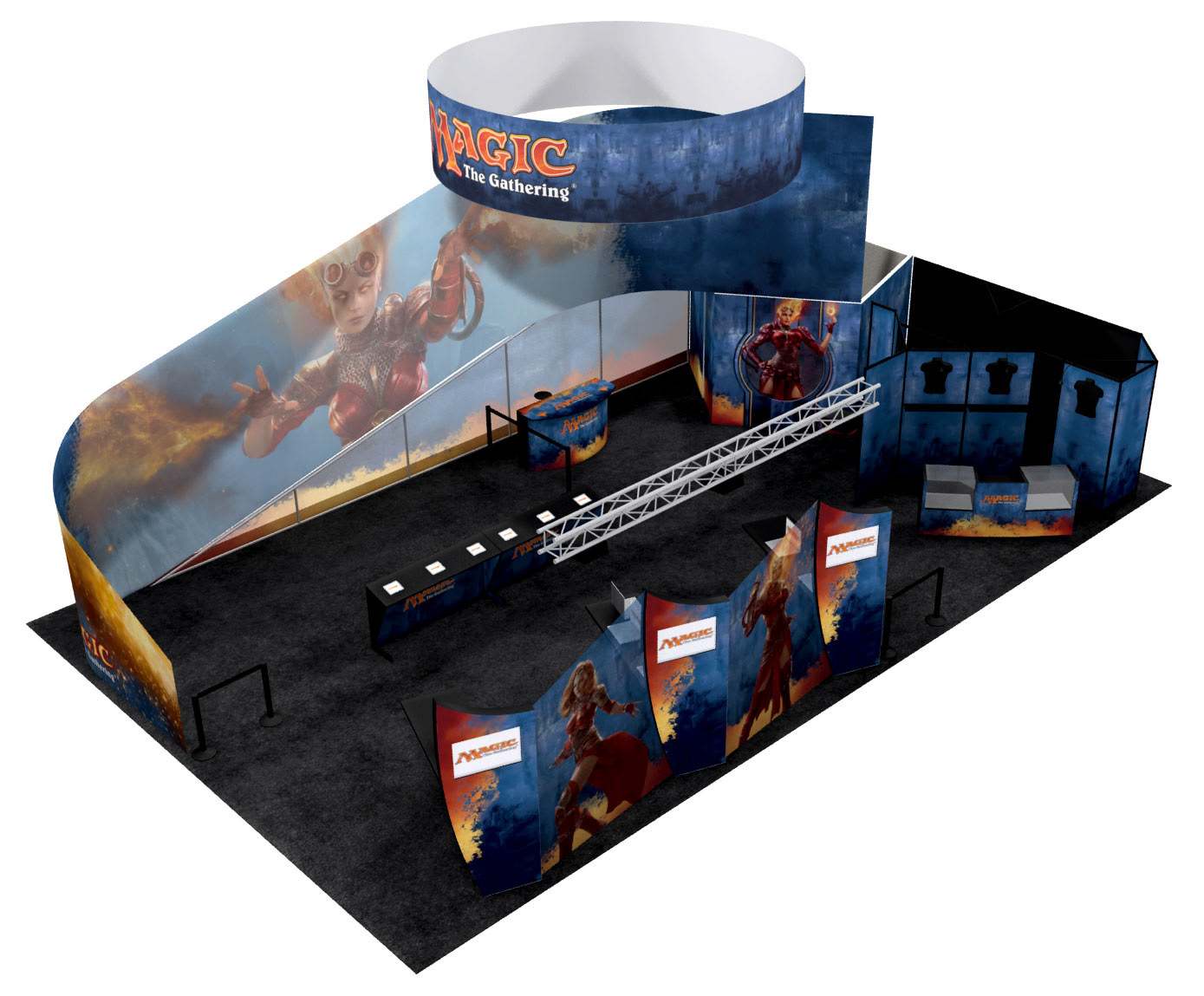
Big, shiny booths like this one are undoubtedly effective, and I’m sure they generate awareness and revenue…but I tend to avoid them. It’s unlikely that anyone working this booth can talk about their latest drafts or describe the art direction for the latest expansion. We can’t argue about a new mechanic or tournament structures.
This booth exists to reinforce an already popular brand. It would be weird if they DIDN’T have a giant impressive display at GenCon.
Same for booths that sell merch. While there might be some interesting things available, I can find all that stuff online. No one can tell me how they come up with their idea for the latest hololive plushy.
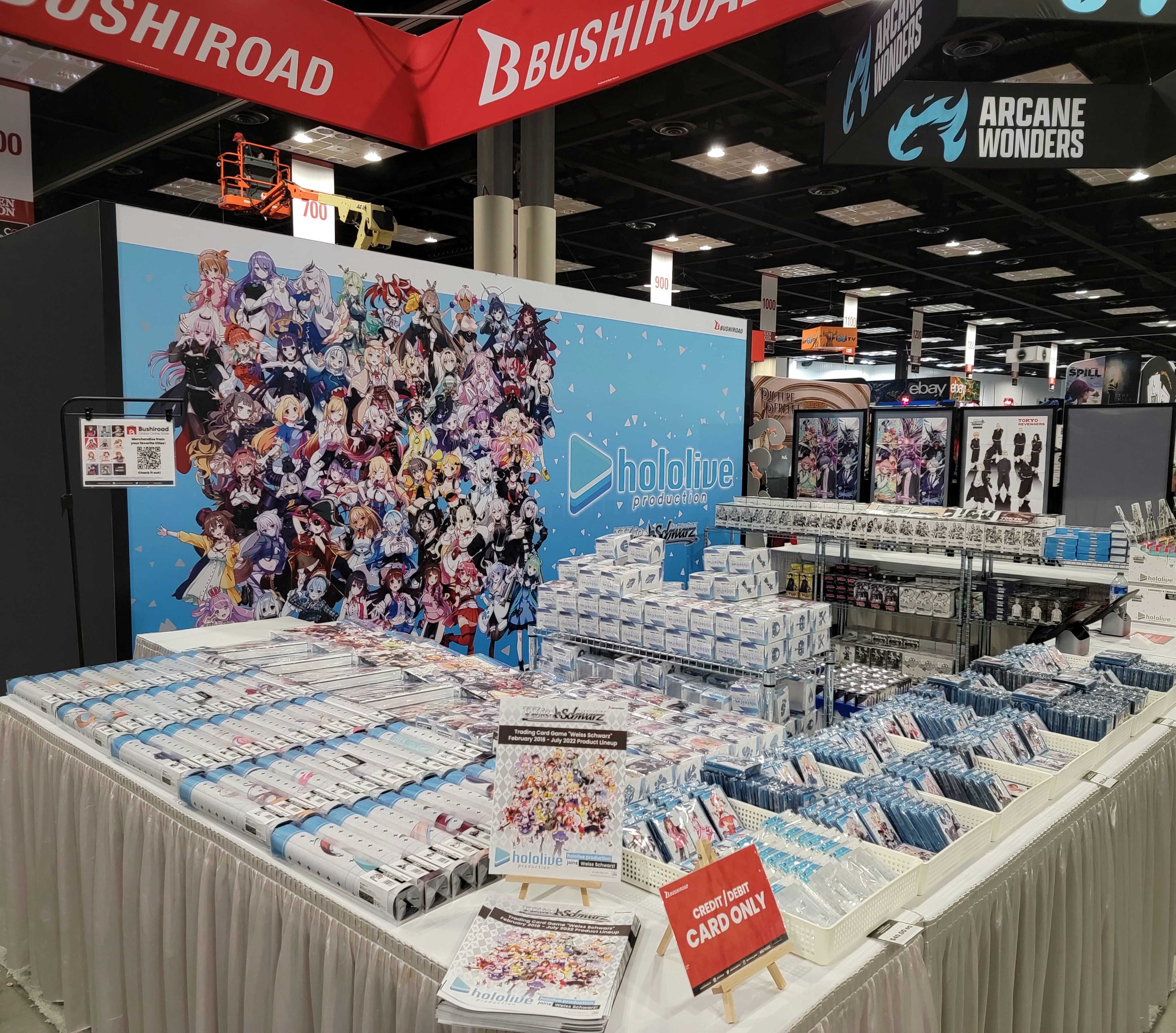
There are a few exceptions, of course. This booth below looks too slick to engage me, but after a bit of research looks to be from a small(ish) team. If the creator(s) are there, then I’d love to pick their brain about stuff.
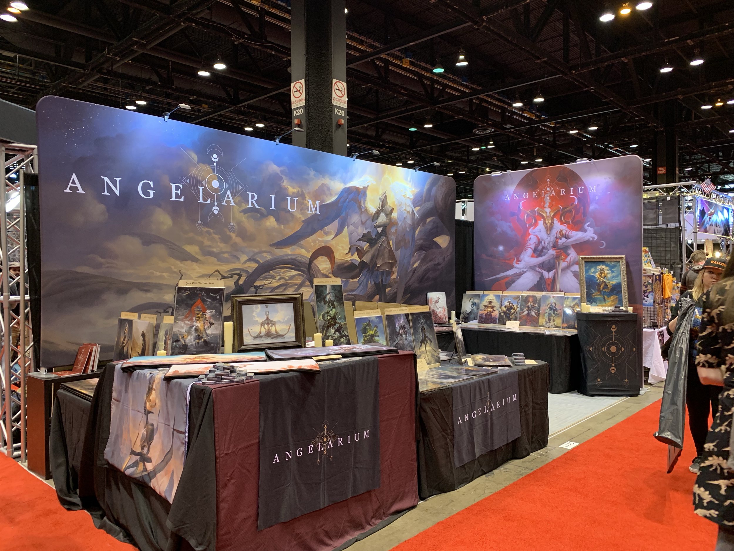
Of course, because it’s so shiny it might be packed with people and I won’t get the opportunity for a good conversation.
The booth from Indie Press Revolution is packed with lots of lovely games, and their workers might actually be able to give me some good info. But they’re primarily here to sell books, not discuss RPG trends and give recommendations.
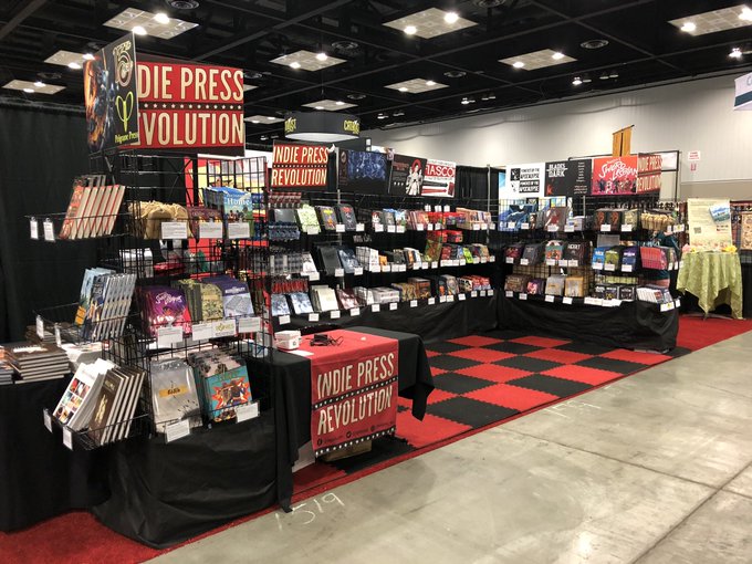
To be clear, there’s NOTHING wrong with this. A lot of people go to conventions to shop for merch and buy stuff. And for the last few conventions I’ve been trying to attract those kinds of people: bigger signs, professional displays, more merch, etc.
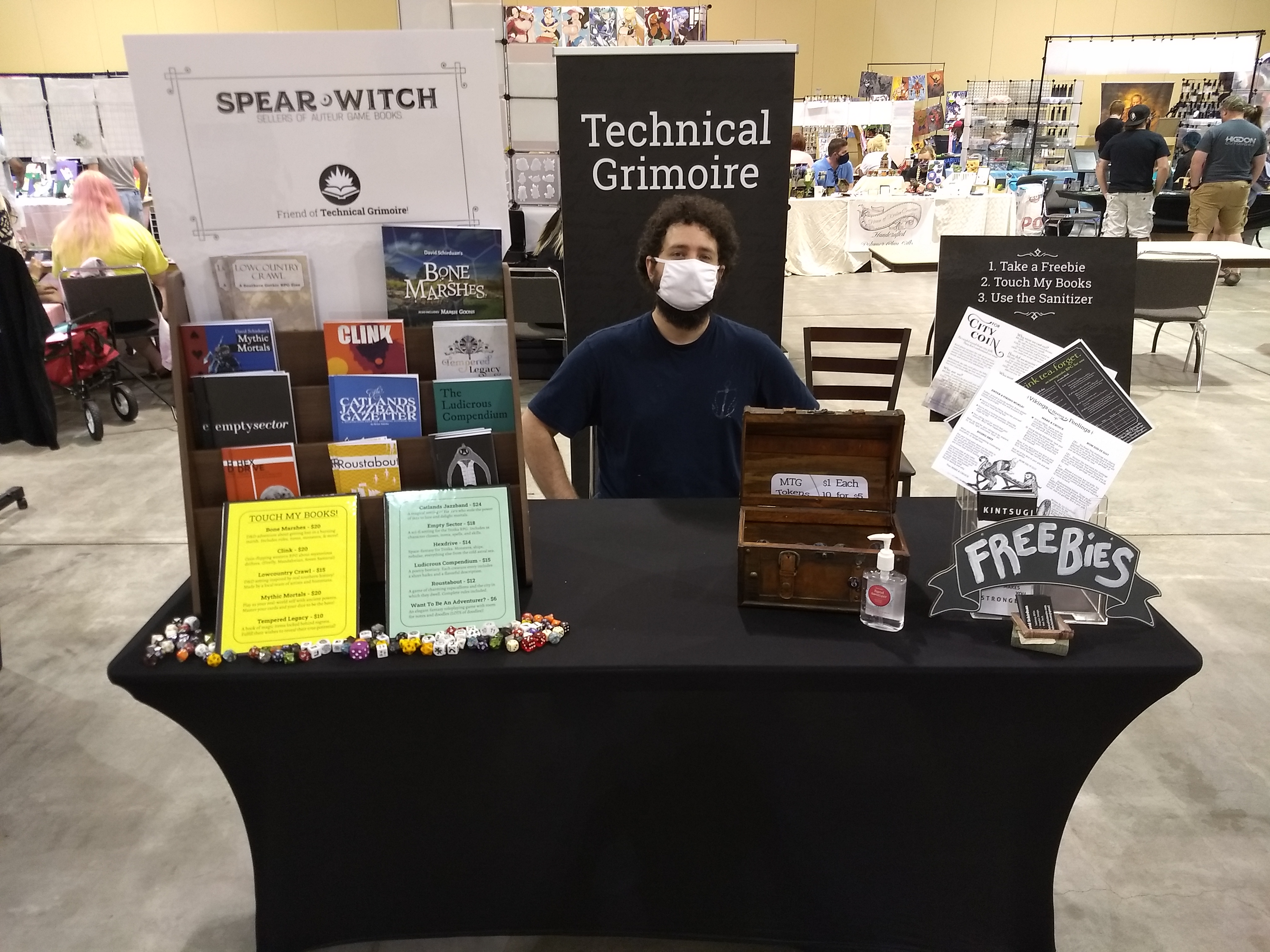
- A clean-looking bookshelf to display my books. It’s vertical height should attract customers to the table.
- Prices clearly displayed
- A chest of cheap tokens to draw people in; they have nothing to do with RPGs.
- Dice scattered around to signal that this is D&D-type stuff.
- Signs EVERYWHERE. Even the books are little mini-signs.
And while all of those things make sense, I didn’t see much engagement with the books themselves. People seemed resistant to touch them. They look like display items, not interactive objects.
And I want people to touch my books! How can I fix this?
Simplify and Engage Permalink
To contrast the previous booth setups, I was enamored with these two setups from Spear Witch and Loot The Room.
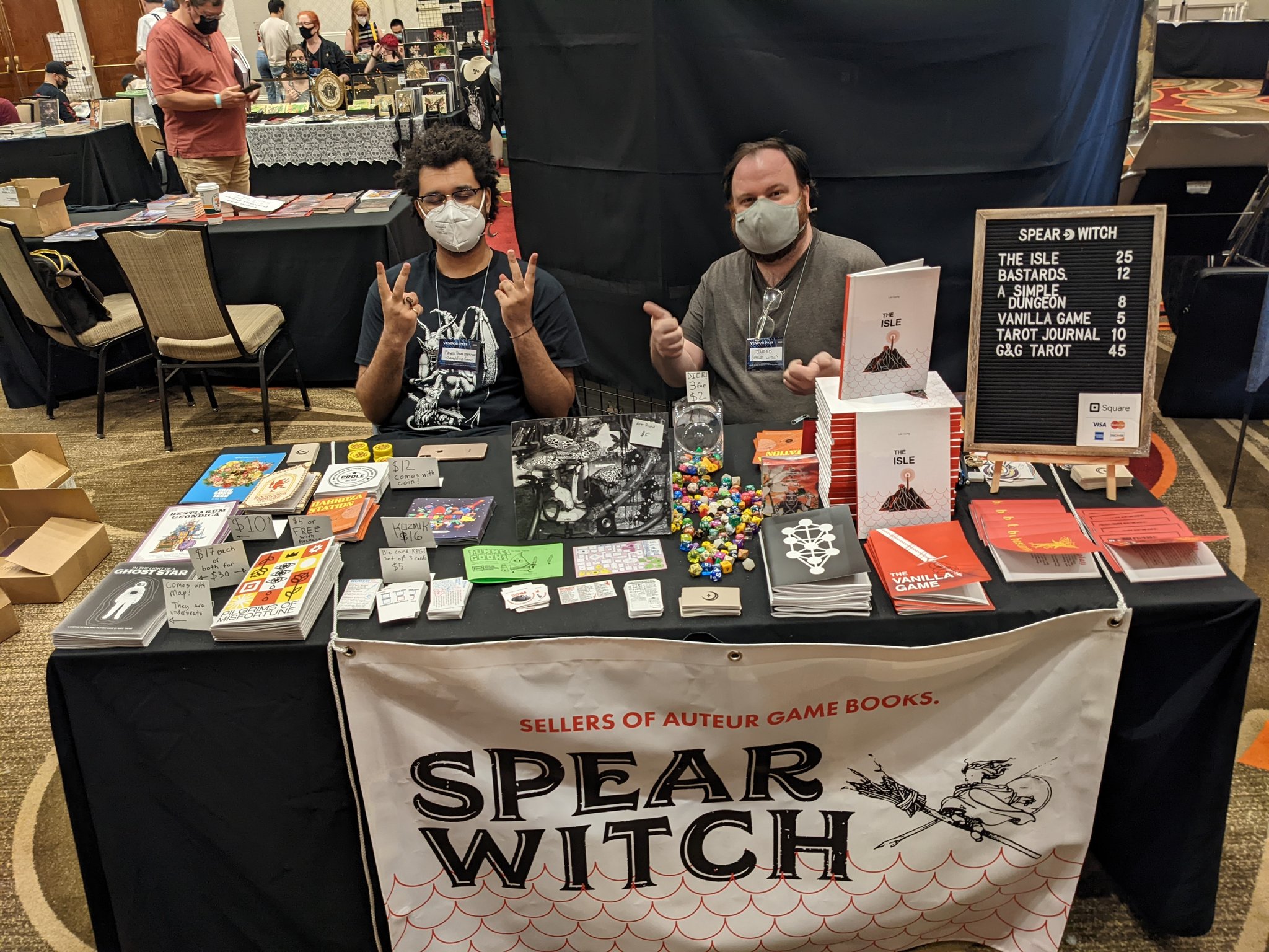
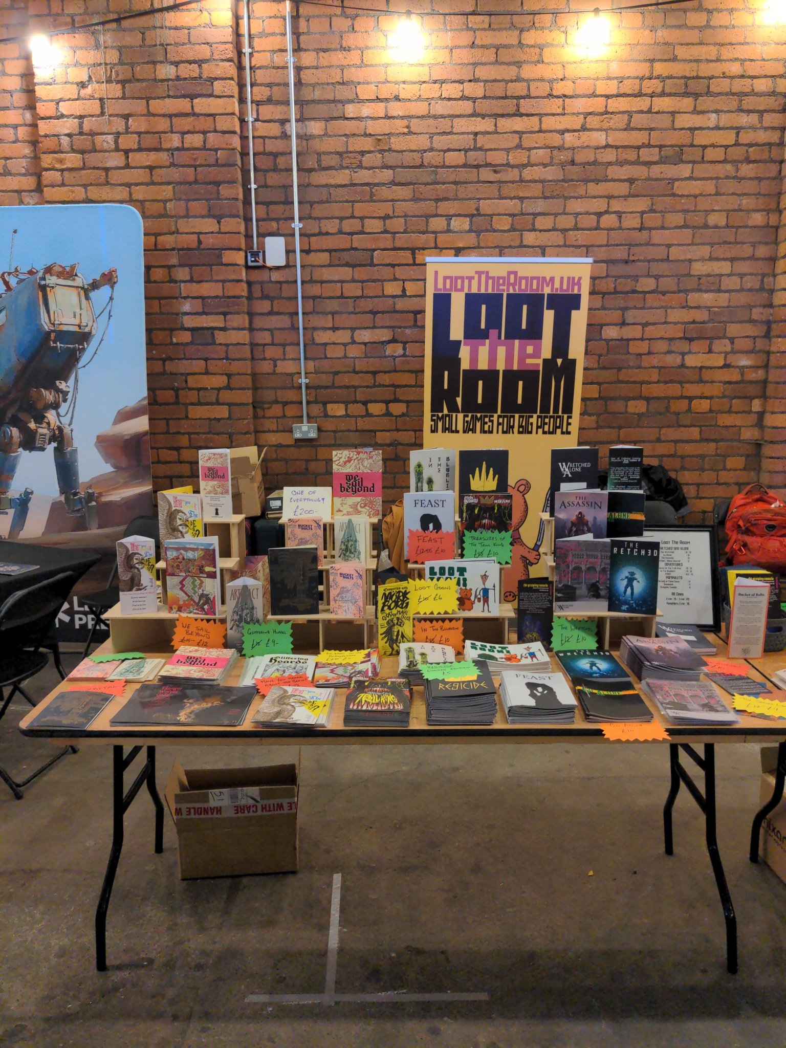
Look at this disagrace of a booth! Just one sign? Halphazard price displays? Books just plopped down on the table! Where’s the verticality? Where are the different kinds of merch?
And yet…if I saw this booth at a convention I would beeline for it! I’d want to hear about all the books, how they were made, what weirdness is contained within, etc. I’d want to pick up every book and flip through it.
Likewise, at a recent convention I loved these two booths from Brian Tenace and Nerd It Out:
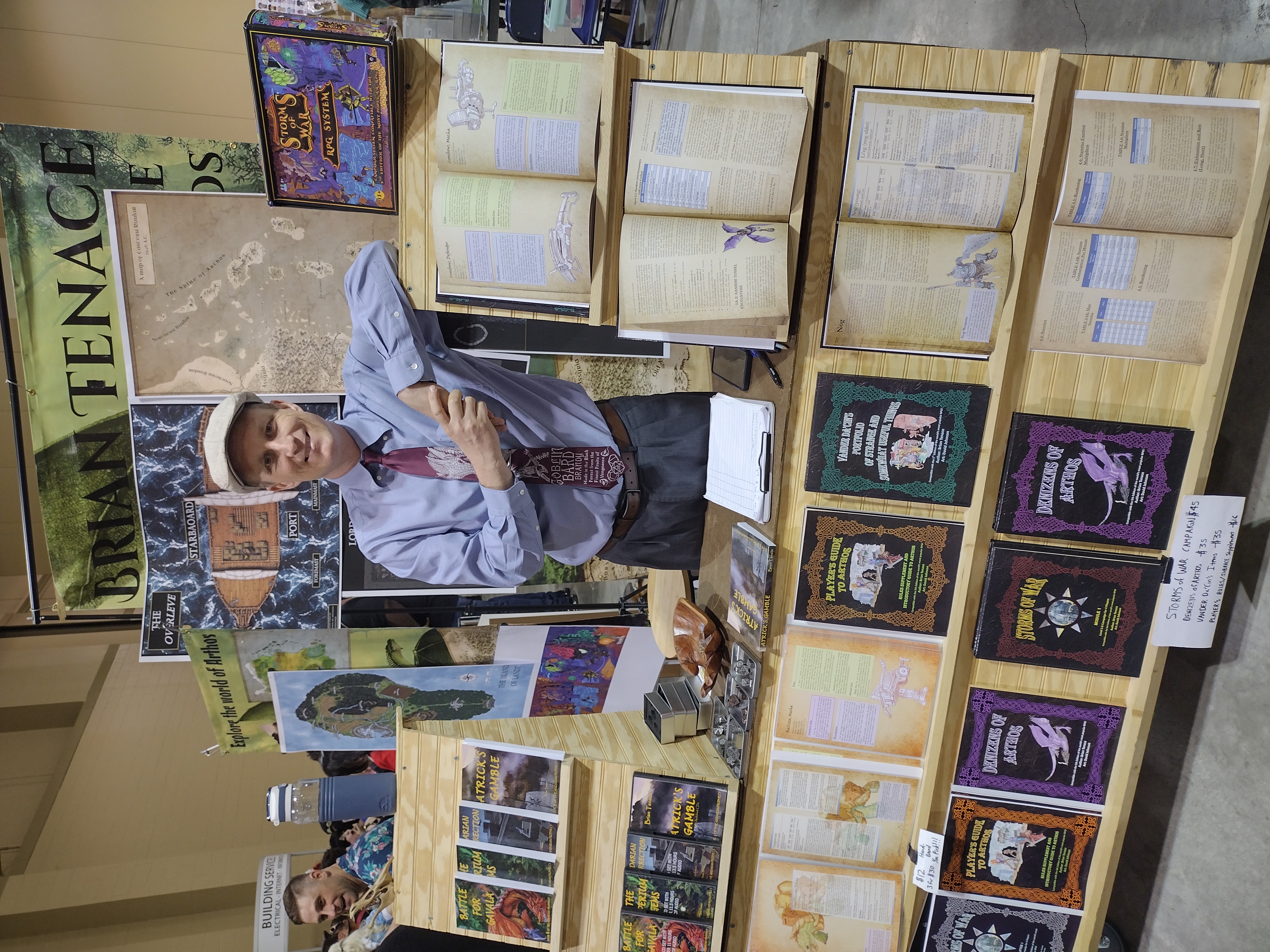
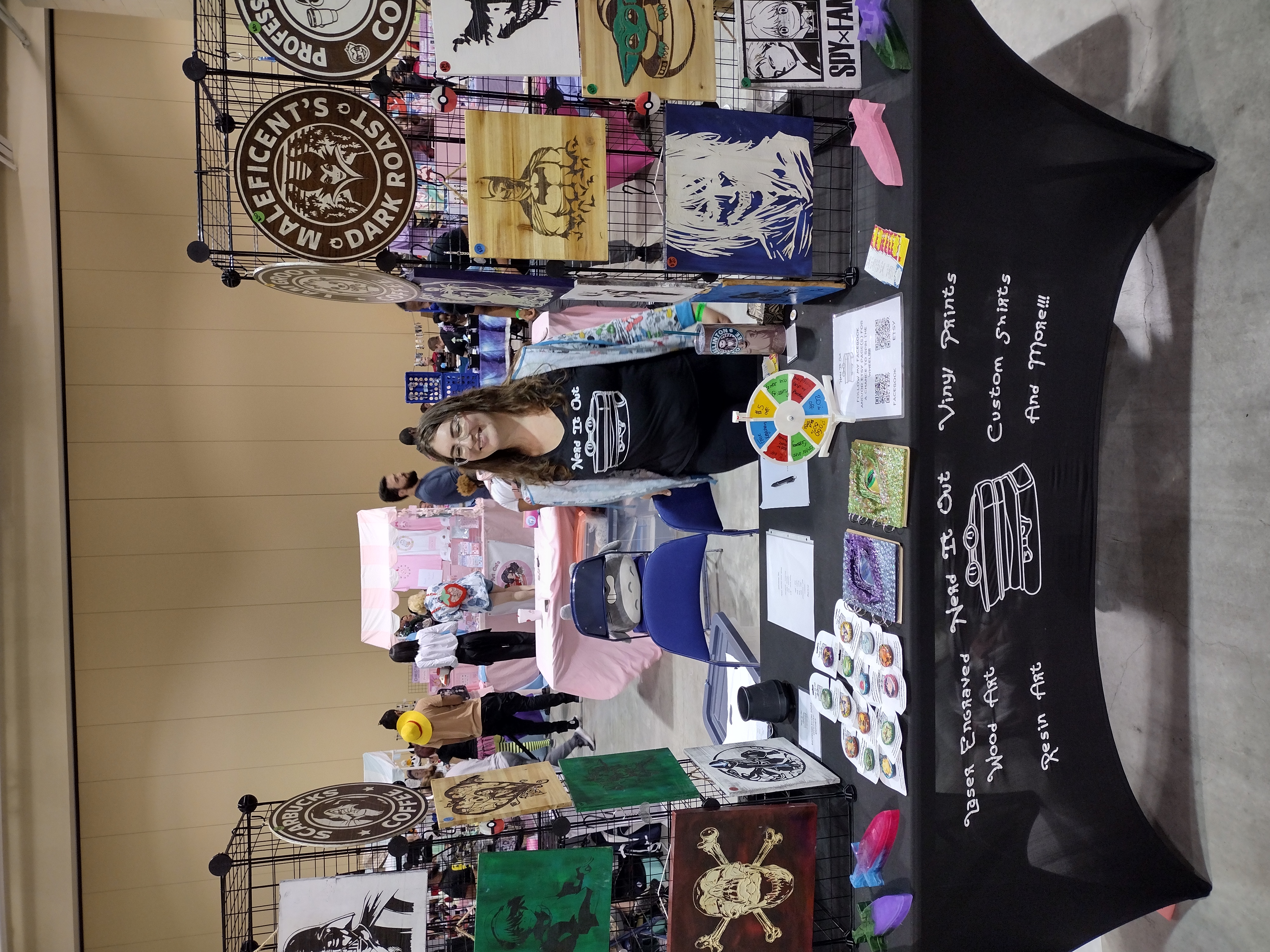
Both of these are laser-targeted towards getting passerbys to interact in some way. I envy how Brian’s setup encourages people to just start flipping pages. The little spinner from Nerd It Out gets people talking and engaging with the booth. It’s a simple thing, but powerful. It worked on me!
This is what I want from conventions: engagement and conversation. Now how can I modify my own setup to provide that?
Behold, the Obsidian Slant! Permalink
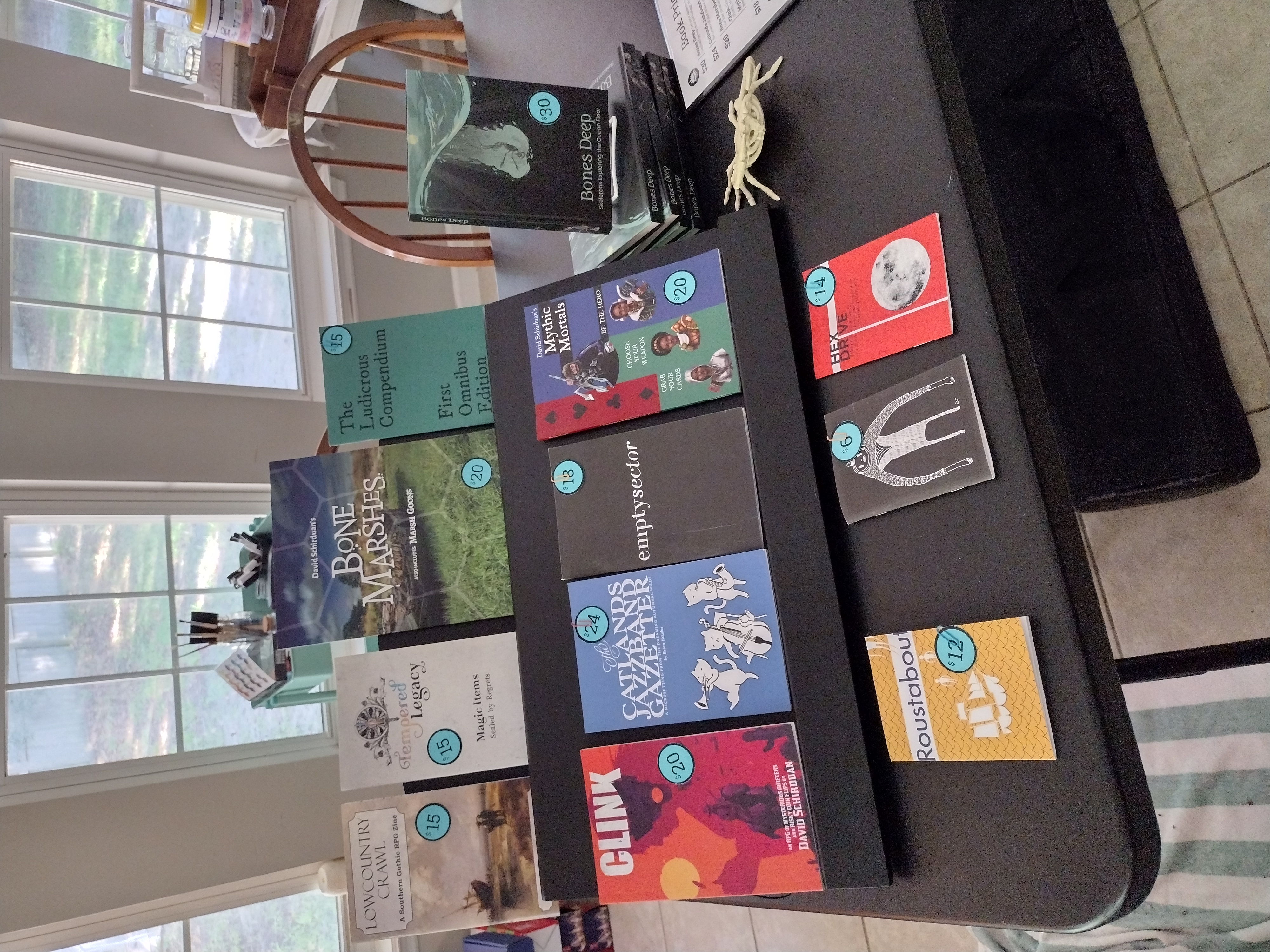
Goodbye bookshelf. You did not encourage people to touch my books. Hopefully this slant will do much better in that department. There’s enough room to pick up a book and put it back without feeling awkward or shaky. And we still preserve some verticality.
We have Bones Deep set off to the side for now, but it could fit on the slant if it needed to.
Price stickers are right on each book; one less sign to deal with. I have a little book menu, but I still haven’t decided if I’ll display it or just hand it to interested customers.
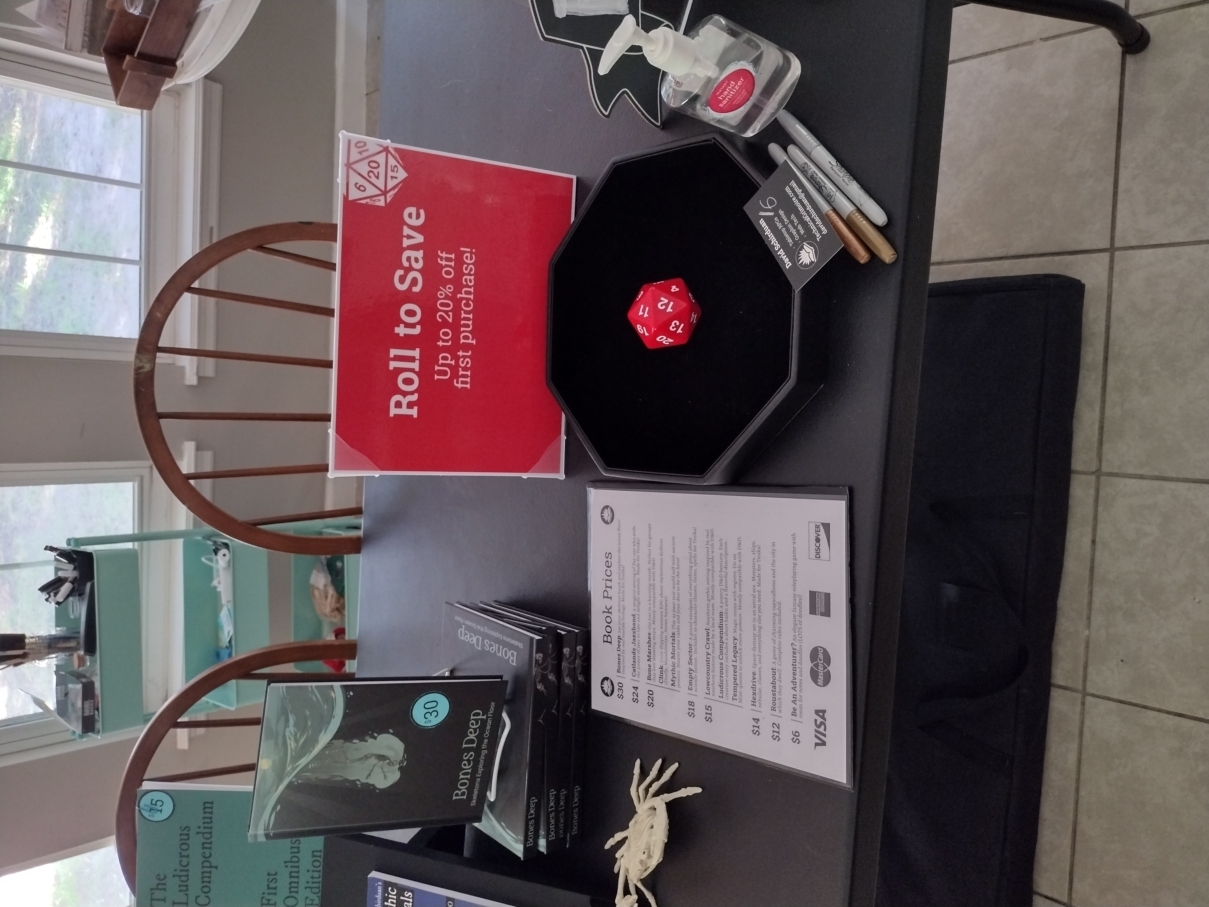
BIG HEAVY D20! This thing feels amazing to roll. And we added a sign to drive home that interaction. Hopefully folks will engage, win a decent discount, and then use that discount to buy something. I will write the discount on a business card and hand it to them; two for one style.
I even have some fun goodies for folks who roll a 1 and “fail forward”. You’ll have to visit the booth to learn what they are…
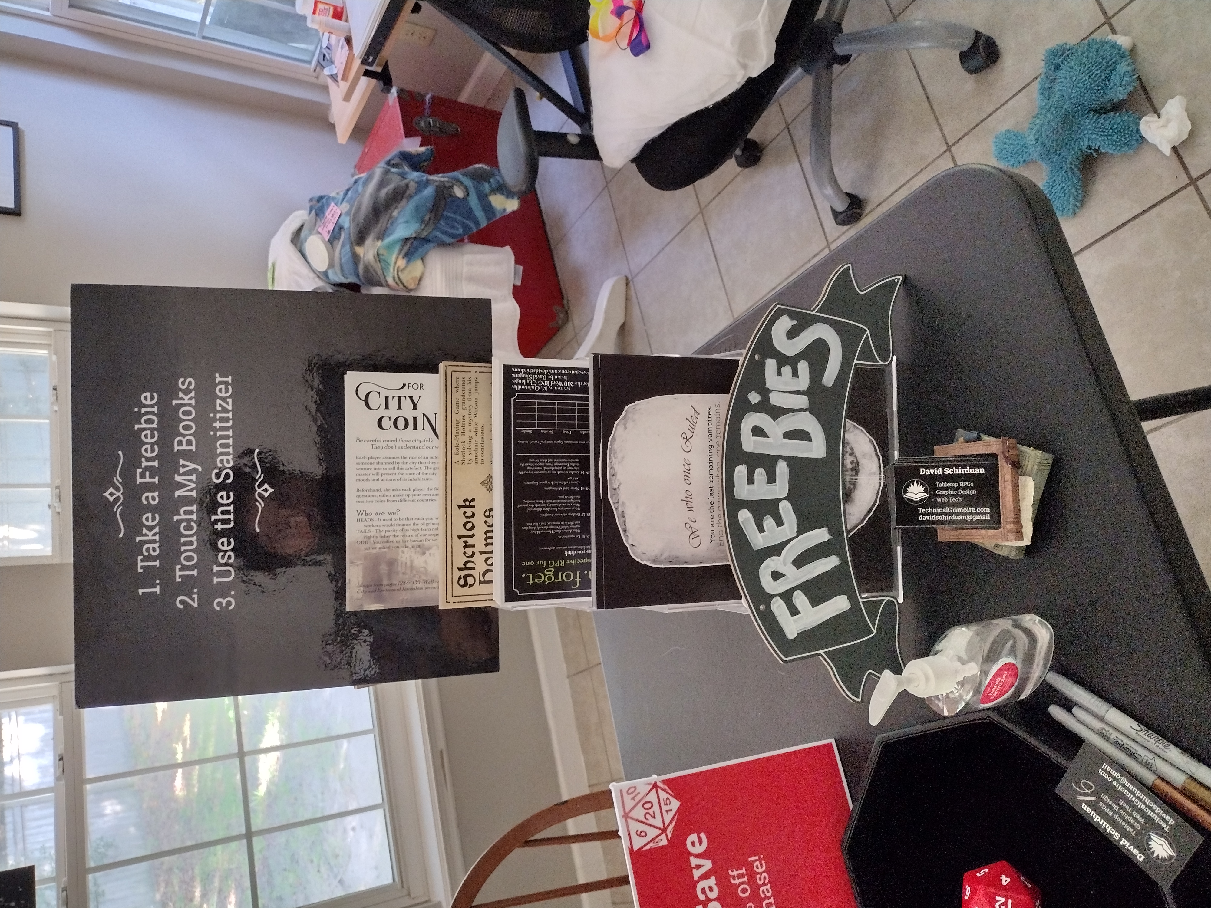
The freebies return, as usual. They are such a powerful way to showcase what an RPG is and give people something to enjoy right off the bat.
I’ll be at Savannah Comic Con over the weekend, and afterward I’ll update this post with a sales report and feedback.
Wish me luck!
I Survived Savannah Comic Con Permalink
As always, I learned a few lessons:
Bring an extra tablecloth. The tables were not the size we were told, and if I didn’t happen to have a bit of extra fabric on hand it would have ruined my display.
Don’t bring so many books. I was far too overeager and brought 3 large, heavy boxes of books with me. I could have fit them all into 1 box…ugh. Punished by my own hubris!
Don’t wear a costume. Sure, it was kind of fun but it really drained my energy, it wasn’t very comfortable, and most folks didn’t care. Maybe if I had some INCREDIBLE outfit it would draw more people…but likely my grumpy mood did more harm than the costume did good.
Aside from those minor issues, it was a great convention! We did really well.

Sales breakdown over the two convention days:
- 5 Lowcountry Crawl
- 5 Bones Deep
- 4 So You Want to be an Adventurer?
- 3 Clink
- 3 Tempered Legacy
- 3 Mythic Mortals
- 2 Catlands Jazzband
- 1 Bone Marshes
- 1 Empty Sector
By far our most successful convention yet. This one was VERY large, with a huge emphasis on the vendor booths. We weren’t tucked into a back corner; instead the vendors were the main draw! Major props to the convention staff for planning and organizing everything well for us.
What about the new gimmicks? How did they go?
The Dice Discount was not as much of a draw as I hoped, but it did help sell more copies. I’ll explain what I mean.
What I expected: People would see the die, read the sign, and then roll it. If they got a good discount, then they might buy something or took a closer look at the books.
What actually happened: People came to look at the books, grab a freebie, and were ready to buy something THEN they noticed the dice discount.
The dice discount was a last bit of encouragement to buy a book (or two or three). One major exception was when a college student got really excited about Bones Deep, but could only afford it with a 16% discount or higher. He started roping in random passersby to rolls the die so he could use their discount. I think he convinced another 2-3 people to buy books on his own!
By contrast, one guy came by and said “Wow! That’s a really cool way to sell books and engage customers. I bet it convinces a lot of people to buy stuff.” Then he left without buying anything!
The die was a positive addition to the booth, and maybe with better signage it could be a bigger draw.
Stacks VS Slab came from a conversation I had with Jim Crocker on discord. He pointed out that stacks of books have a few big benefits for convention displays:
- People understand you are selling the books, not just advertising them.
- More people can look at the books; rather than just one customer at a time.
- Shows available stock to customers; if only one book is left they might be encouraged to grab it.
So in my brain I had resolved to try the slab one day, try the stacks the next day, and compare them. However, since the tables were so much larger than we planned for, I had room to spare.
I think I have to admit that Jim was right about the stacks. More people reached for the stacked books instead of the slab books; even though the slab ones had prices on them and were made for easy handling.
I guess some folks thought they were display only? I’m not sure. But while the slab looks nice, I’m glad I had room to scatter books around. In the future I’ll try to have both, but if I HAD to pick one, I’d go with the stacks of books. Wild.
Future Plans Permalink
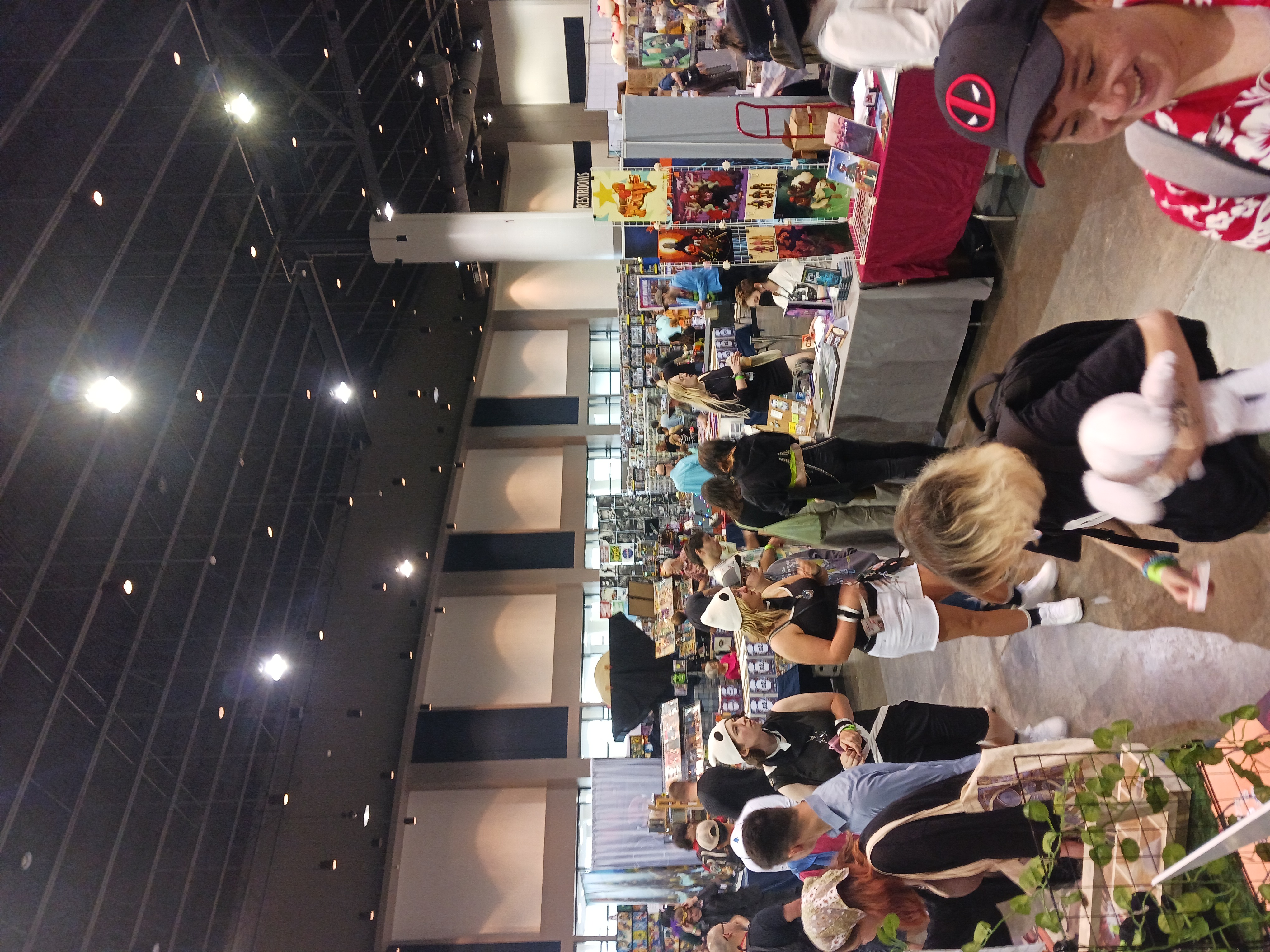
I have one or two more conventions on the horizon, but one big improvement that I’ve been thinking about is some poster displays.
From the image above you can see that a lot of vendors sold art and had these nice tall displays. Our books have a ton of gorgeous art in them; maybe we should get some posters printed and hung above our booth.
Of course, then I worry that folks will actually want to BUY posters. Just something to think about.
I hope you found these rambling obversations useful. And maybe we’ll bump into each other on the convention circuit!