Jalopy Design: Making a Zine

I’m like that co-worker who drives an old junker. When you ask them, “How do you keep that thing running?”, the advice you get will be useful…but probably no replacement for hiring a real mechanic. View all Jalopy Articles here.
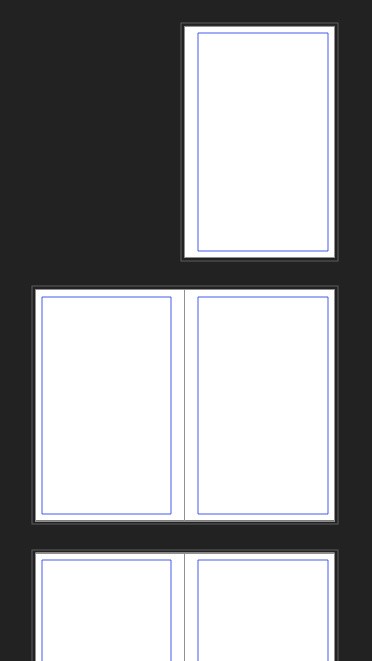
As part of my continuing Jalopy Design series, I thought I would give you a peek behind the curtain and look at some of the things I learned while working on Lowcountry Crawl. It’s available for purchase now! But here are some example spreads so you can decide if you want to take my advice on layout:
This will be less of an in-depth tutorial and more of a random dash through what I remember about making LCC.
1. First I’ll talk about some basic Publisher settings, and some “gotcha” settings I messed up originally.
2. How to insert text.
3. Insert Images and make them black and white.
4. Then we’ll talk about Font selection, spacing, and styles.
This will hopefully give you enough advice to get started.
Before we start
I want to warn you that most of this design stuff is self taught. I didn’t go to school for this, and I only read ONE book (The Non-Designers Design Book by Robin Williams).
In fact Lowcountry Crawl was the first project that I designed myself. Text came from John Gregory, and the GOOD art from Charles Avery; but I did everything else.
Most of my knowledge comes from:
- Cool random resources.
- Stealing ideas from other books/zines (Girl Underground and HSI were big influences for Lowcountry Crawl). This is one of the best ways to learn, go through your favorite book and look at how they place images, the fonts the choose, and the spacing they have.
- Advice and help from Joe Banner. Not only is he a brilliant designer, he’s also a really cool guy and watching him work on Bone Marshes taught me a lot about design.
- Advice and help from Andrew Barton. A local designer friend of mine, he had a bunch of great observations that I’ll mention later.
- Wild experimentation and stupid mistakes. This is key; set aside time to mess around, make mistakes, print drafts and start over and over and over and over…
1. Document Settings
Create a new document in Affinity Publisher. First, decide on the size of your Zine. I recommend doing half-pages just because it’s simple to print at home (and easier on your local printer). For Lowcountry Crawl:
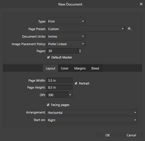
- 2 Pages. It started at about 16, but bloomed as John wrote more stuff and I found cool art. It should always be a multiple of 4, so you have complete double-sided spreads.
- 5.5x8.5 inches. It’s a US Letter page folded in half. Simple and easy to prototype.
- Facing Pages. Make sure you check this little box! it makes it MUCH easier to visualize how the pages will look in the actual book, rather than seeing one page at a time. Every two pages are called a “Spread”.
- DPI 300. You want this if you plan to print your zine. Otherwise your images will be pixelated and gross.
- Color: CMYK. I actually don’t know what this means, but I know CMYK is better for fancy printed stuff. So we’ll use that.
- Margins. 1/2 inch inner margins (where the spine folds), and 1/4 everywhere else. I had 1/8 for all margins originally, but Andrew pointed out that it won’t leave enough room for the spine, OR for people’s fingers to hold the pages. Do not fear white space. You don’t want your zine to look cramped.
- Bleed. Most printers recommend 1/8 bleed on everything, but contact the printer you plan to use just in case. Affinity lets you export the document without bleed, so turn it on now. I made this mistake, and had to go back and resize all my images to fill the bleed. Turn it on now, and use it!
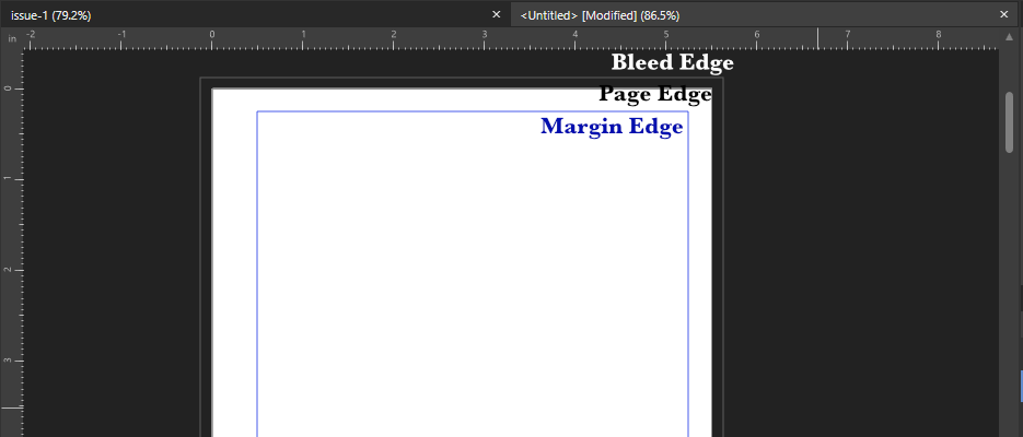
What is Bleed? The quick answer is that it’s some extra room so that they printer can make a mistake and not ruin your book. If you have a colored background or an image that bumps up against the edge of the page, you want it to be inside the Bleed. I’ll give an example later.
Smash that “Okay” button, and let’s jump into the empty void!
2. Text me, Baby!
A blank canvas is the scariest thing. Luckily you did the smart thing and wrote a bunch of content BEFORE starting layout. Right? Riiiiiight? Good. If you just need a bunch of random text, use a Lorem Ipsum Generator.
You see how page 1 is floating at the top all awkward? That’s the front cover. Pages 2 and 3 will actually be the first Spread of our zine. Covers are hard, so let’s do the lazy thing and not worry about it.
Let’s start by dropping in some of that beautiful text you’ve written onto page 2.
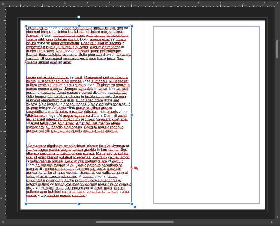
1. Select the Frame Text Box tool and draw a box on the left page.
2. Paste in ALL your text. It won’t fit, that’s okay.
3. Resize the text box to fill the page. See how it adjust automatically? Also wow, that page is PACKED with text. We need to put a little space between the edges of the page and the text box.
4. That’s what the margins are for. Re-size your text box to fit along the edge of the margins. Always keep your text inside the margins to keep that nice clean space along the edges. But all of the text doesn’t fit in this one little box. We need more text boxes!
5. On page 3 create another empty text box.
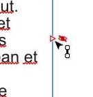
6. Click the little red arrow next to the eye on the bottom right of the first text box, and then click inside the second text box. Now your content spreads from one text box to the other. Try re-sizing both of them to see how they adjust automatically! Cool right?
7. Fill the rest of your pages with text boxes, and link them all together until your pages are full or you run out of content. Remember to keep them inside the margins!
Notice how the margins on the even-numbered pages are different than the odd numbered pages. Affinity handles that automatically, and knows which pages are on which sides. Neat!
3. An image is worth 1000 hours of frustration
Let’s add some images. Now just like everything else there’s a million cool things you can do with images, so we’ll take the easy way out and keep it simple.
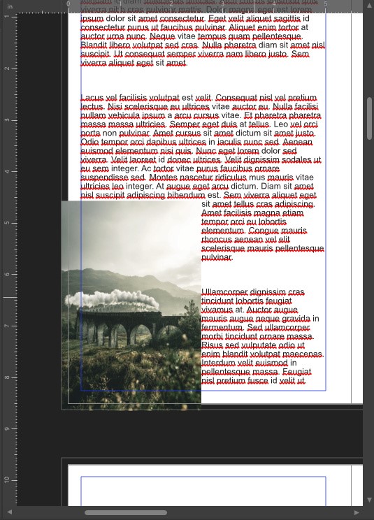
1. Click the Place Image tool, and pick an image you want to insert. Then click anywhere on the page and drag until it’s the size you want.
2. It’s there, but it just covers the text. That isn’t what we want at all! So let’s give it some space.
3. Click the image, then click the Text Wrap settings, and set it to “Square”.
4. Now you can drag the image around, and text will jump out of the way!
We have the image there, but let’s put it in the bottom left corner for now. Either keep your image in the margins, like text, or put it ALL the way to the edge of the Bleed. Remember that the printer needs that extra wiggle room.
If you’re making a black and white zine, then we need to tweak the images a bit.
5. Click the image, and then click the “adjustment” button. (the little half-circle in the center bottom)
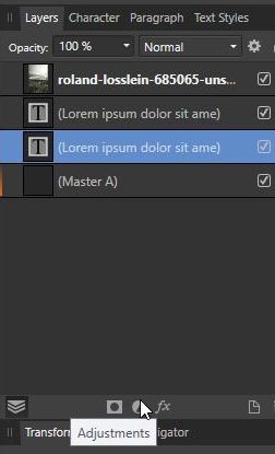
6. We want HSL.
7. Drag the saturation all the way down until the color is gone.
8. Close the HSL window.
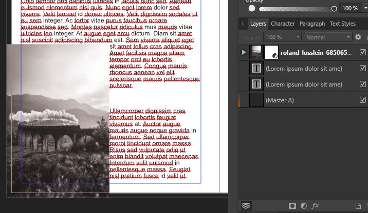
Now our images are black and white, fills the bleed, and the text made room for it. Things are starting to look good! We need to do SOMETHING about that font though. Arial is so “5th grade book report”.
4. Comic Sans is bad, y’all
Fonts are important, but they’re not THAT important. We only need two fonts to make this look nice:
- A header font for sections and page titles. Pick something stylistic and cool.
- A body font for most of the text. Pick something boring and readable. Simple and clean.
Enough stalling, let’s get back to the numbered steps!
1. Go to the top of a text box, enter some text on a new line at the top. Something short like “New Section”.
2. Select the new line.
3. Click “Text Styles” along the right (it’s well-hidden)
4. Then click “Heading 1”, and watch the text jump in size and to the middle. This is the default setting. We want to change that a little.
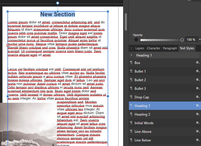
5. Select the text and change the font to whatever you want using the font buttons along the top left.
6. Set the size to 18 or so. 30 is probably too big for this little zine.
7. Easy right? But let’s save this so we can use it again later.
8. Select the text, Click on Text Styles, and right-click on “Heading 1”.
9. Select “Update Heading 1”.
Now Heading 1 is saved, and you can simply apply it to any text you want. This not only saves time, but if you change your mind later, you can change the style across ALL the text at once! Styles are a little tricky, but worth the effort to learn. It will save you a bunch of time.
Repeat the steps above, but with the “Body” style. I wouldn’t go smaller than 10 or 11. Size 12-14 is nice and easy reading for Body.
5. What next?
Next experiment and learn more! Affinity takes time to learn, but you can leave almost everything at the default settings. Don’t be intimidated by all the buttons, just focus on the ones you need right now.
Practice is the most important thing. Just keep fiddling and experimenting. You’ll never be “ready” to make something, so just start and learn as you go. But if you crave structured learning, here are some things to look into:
- Keep stealing ideas from zines and books you like. Maybe you’d like a copy of Lowcountry Crawl to steal ideas from?
- Browse some cool random resources.
- Some online courses from Skillshare or Udemy. I wouldn’t recommend paying for one unless you REALLY REALLY like classes.
- Learn about PDF accessibility. This is something I still struggle with, but it’s critical if we want our hobby to be welcoming to everyone.
I hope you find this advice useful. Let me know what else you’d like to see from this Jalopy Design Series!
Header image Photo by Gyorgy Bakos on Unsplash